top of page

Prototyping SOLISTIC was quite the challenge as I was exposed to new design tools which I have not used before. Invision is an online software that allows designers create and prototype applications, but for me; I had begun using Sketch and so I inserted my wireframes and then prototyped. The transition needed to be adjusted to but overall the practicality became really easy.
Flow A, screen 5 which showcases the profile page directly after logging in.
Each of the highlighted blue areas are the prototype locations that will trigger the movement of the screen to another screen or will pop-up a text field in which the user can use to type in words.

Search Bar: tapping this location once will pop-up a text field, which will allow users to type in words.
Settings Icon: tapping this icon will drop down a menu option to the profile settings.
Features:
Flow E. which is specifically framed to showcase the basic operations of sharing a song, playlist, or artists to your social media outlets.
MUSIC APPLICATION
MUSIC APPLICATION

Special Features:
Flow K, is where users can go explore the international music scene and find music they like. This new idea gives audiences the chance to find specific music from regions, countries, and languages they want to hear.
Or simply discover the world through music.

Flow D, screen 4 showcases the function of adding a song to a playlist.
This screens appears directly after a song has been added to the playlist and a snack bar would appear at the bottom to confirm the action. However there is an "undo" option in the snack bar incase the user decides to go back.

Snack bar will appear after each action at the bottom of the screen.
Undo takes the user back to their previous action.
Playlist box is a collection of songs made by the user.


Shark week is a temporary event hosted by Discovery Channel once a year in the summer. The aim of the program is to educate to general public on Sharks and their ecosystems. Many people are afraid of sharks and with misconception of sharks portrayed by hollywood, sharks are usually hunted and killed.
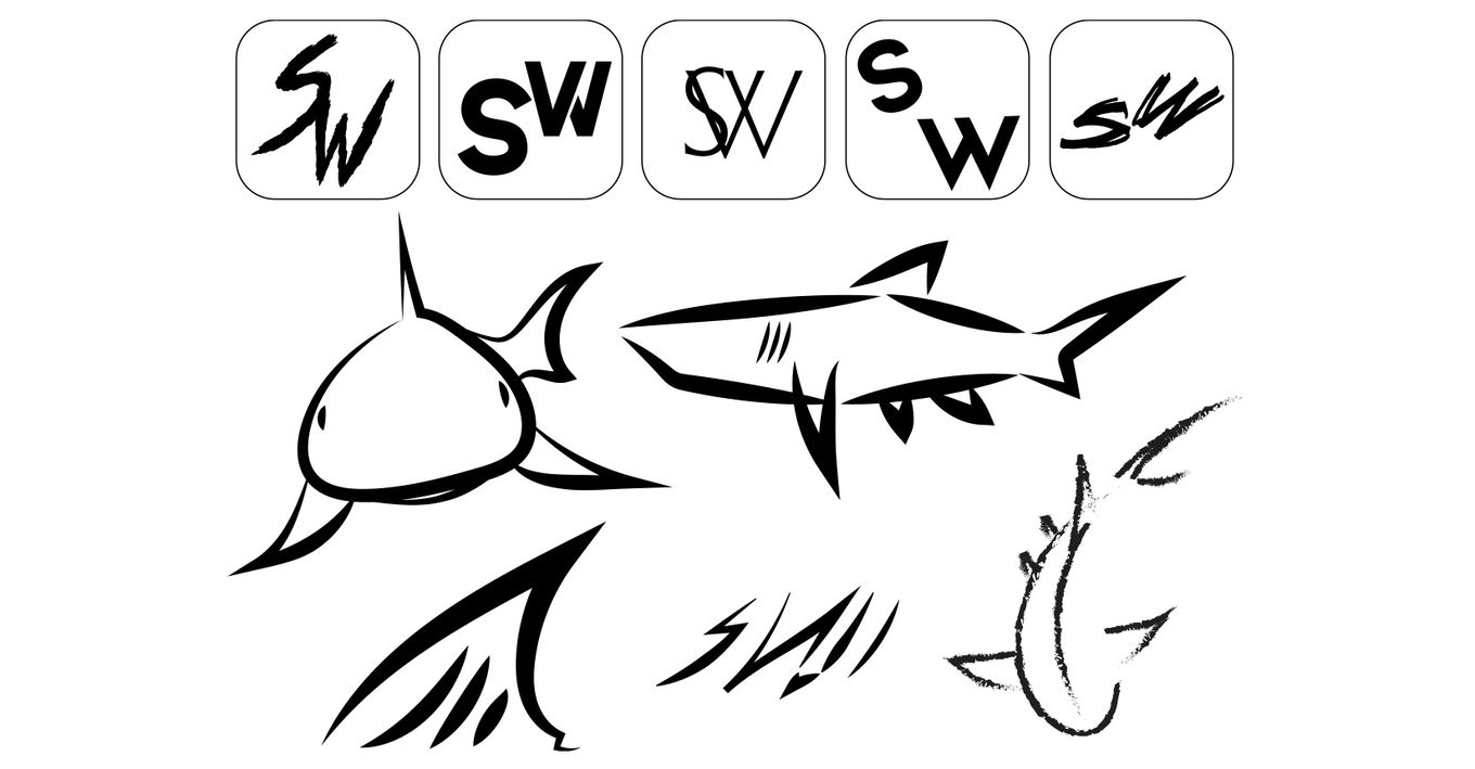
The theme of APEX is the open ocean which shows the vastness of the oceans and the cool colors of the deep blue sea. My goal was to redesign the Shark Week event to attract audiences of all ages. This event is fun and exciting for all who participate.
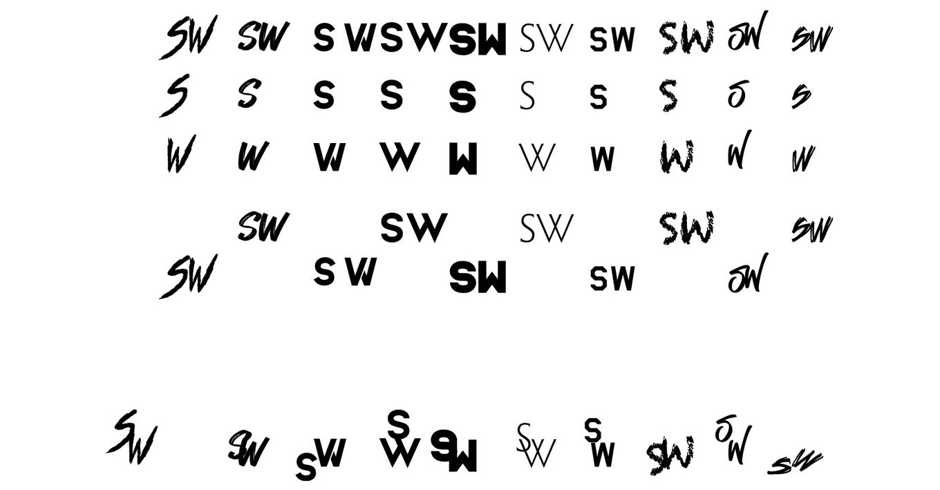
APEX Shark Week stands for dominance over all summer events just like an apex predator of the ocean, sharks.
These are initial sketches of the entry tent and some ideas for the interactive kiosk.


Interior walls of tent


The tent structure pose quite the challenge in developing because the shape itself is organic. I wanted audiences to feel as if they are walking into an open space similar to the open ocean or a very large fish tank.
There are three doorways to the entry tent. The first being the front door, the other two are directly to the left and right. This design allows onlookers to exit or enter other parts of the event.


Kiosk & Banner
The interactive kiosk is designed based off of scientific shark cages used by scientists. The cage allows audiences to have a picture taken inside the shark cage. The side panels are wired up with monitors which showcase the event details along with videos about the event.
The kiosk is meant to sit in an area where foot traffic is heavy to attract audiences. During the event there will be up to three interactive kiosk surrounding the main event location.

The banners for APEX Shark Week are quite simple and straight forward. The sheer image of a great white shark is enough to get audiences attention and paired with the event logo will direct people to the event.

Map Pamphlet
Upon entry each attendee can grab an event guide & map.
The APEX Shark Week pamphlet showcases event details and event showings of videos.
On the back of the pamphlet is alos a kids interactive scavenger hunt. This allows kids to look for clues of three sharks and if completed, can turn into the front desk for official event toys and t-shirt.


Exterior walls of tent


bottom of page


